All projects

eToro

August 2024 · Mobile

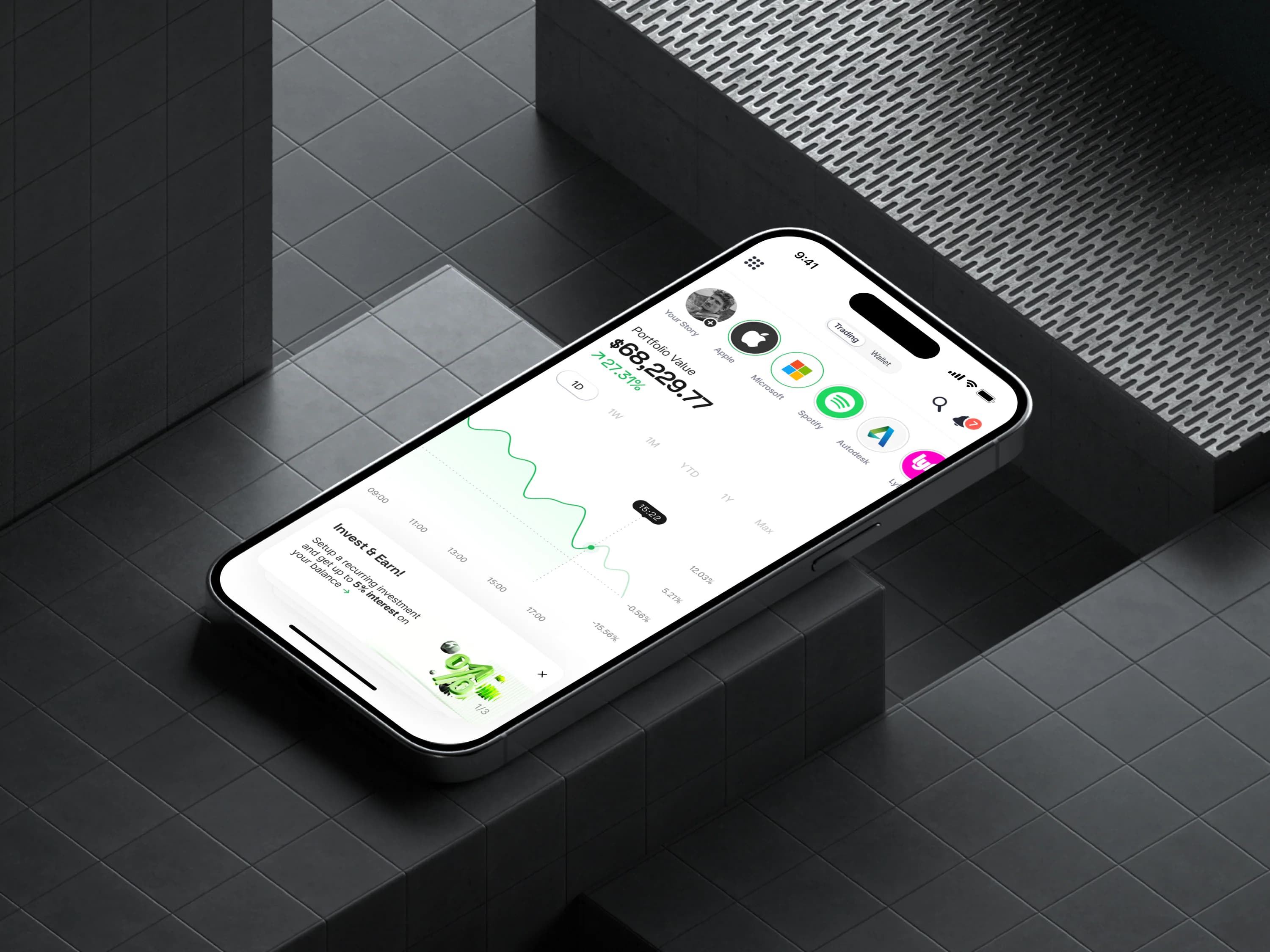
A mobile Home for account status, market context, and frequent actions.

eToro redesigned mobile Home experience

Overview

Home was eToro's front door, but users were walking through it in about two seconds. The page showed a portfolio amount and social feed, while account status, holdings context, market awareness, and next actions lived elsewhere. The redesign treated Home as an account command center first, then shipped two segment-specific layouts before full user configuration.

Role
Senior Growth Product Designer
My focus
Mobile Home architecture, segment-specific layouts, and the path toward modular personalization.
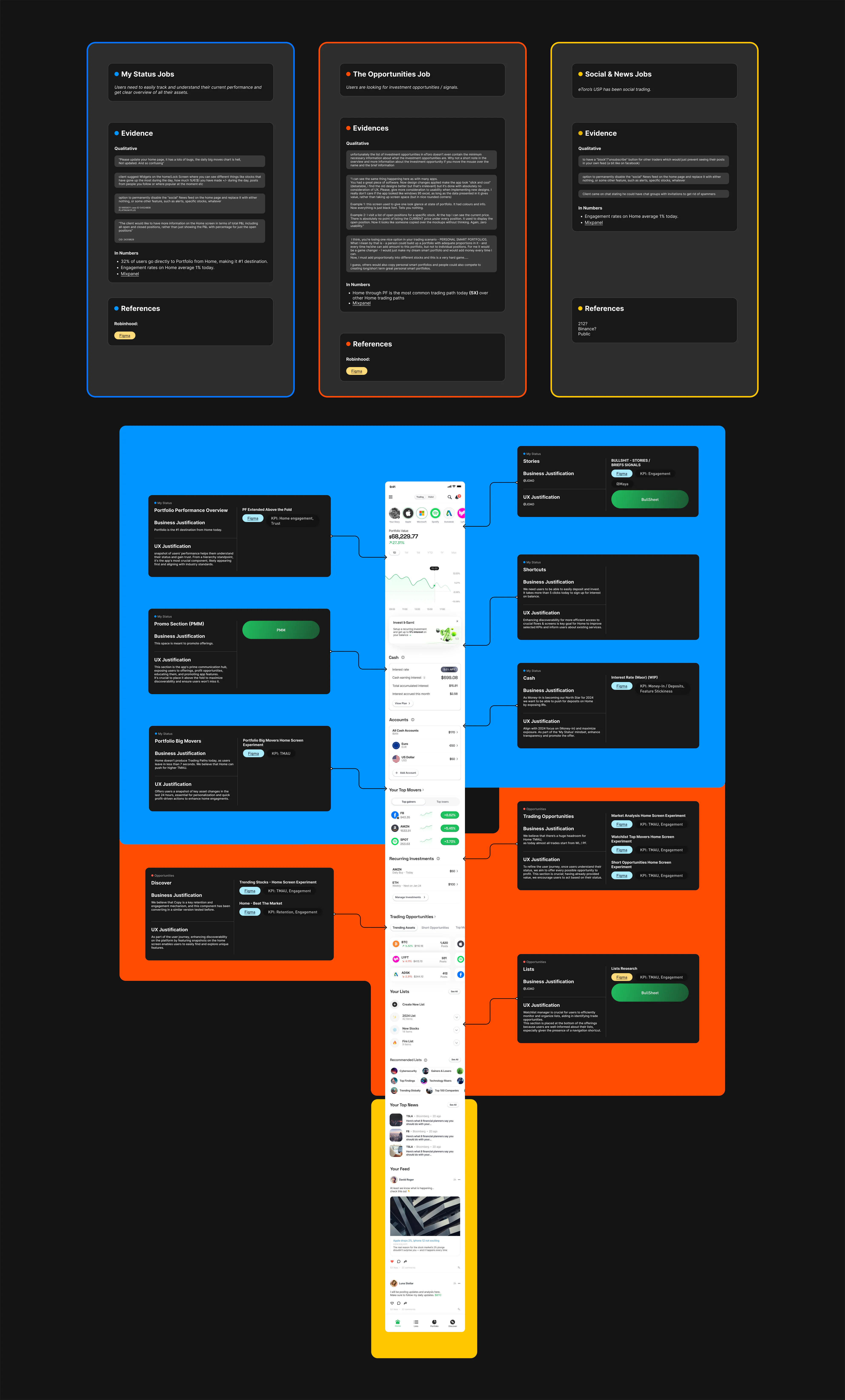
Evidence
  • Product engagement data from the existing mobile Home page.
  • FullStory session analysis combined with product feedback and interviews.
  • Beta feedback and A/B testing used to evaluate individual Home features before release.

Process and solution

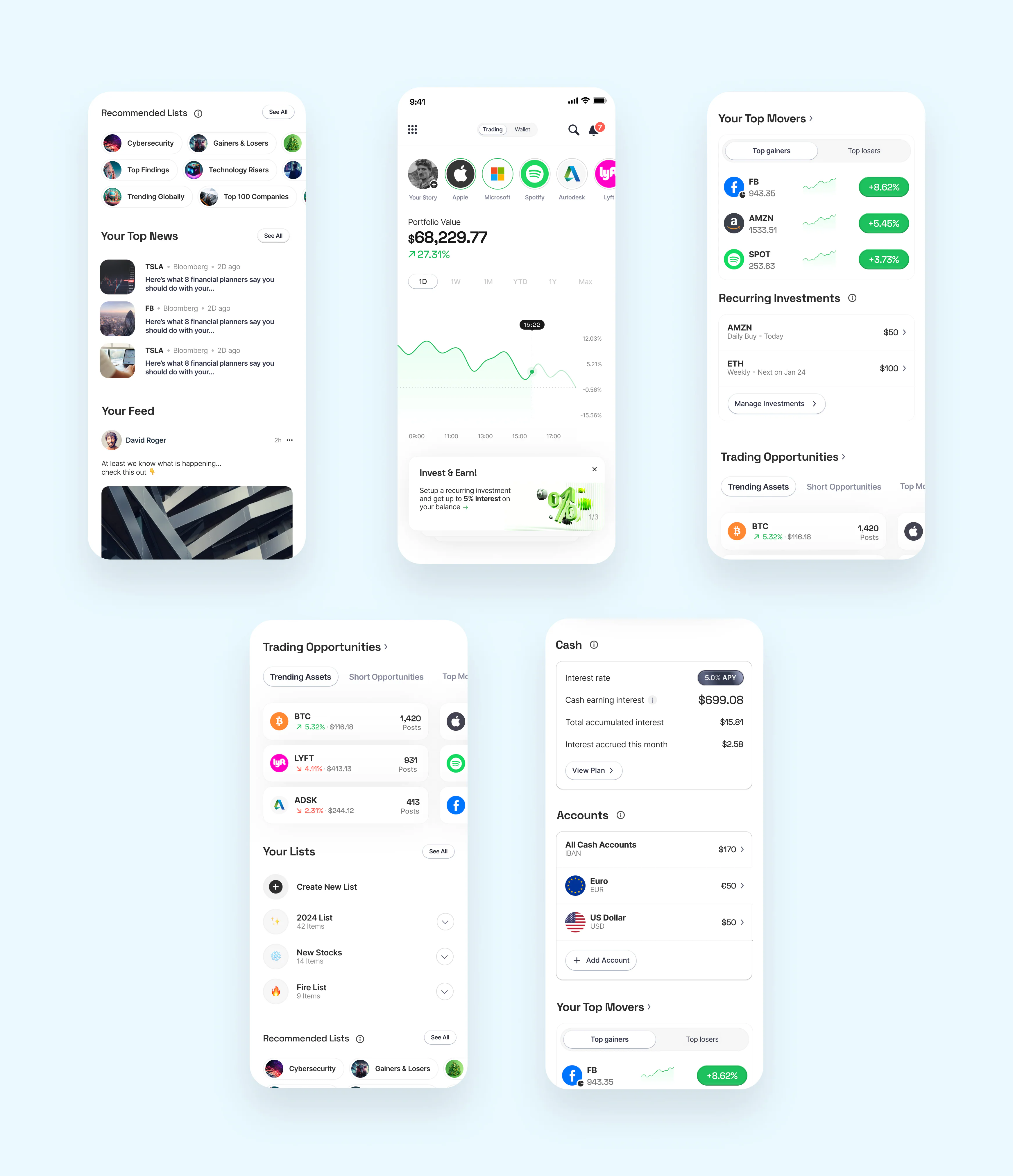
Full redesigned eToro Home experience

Make the first screen answer something

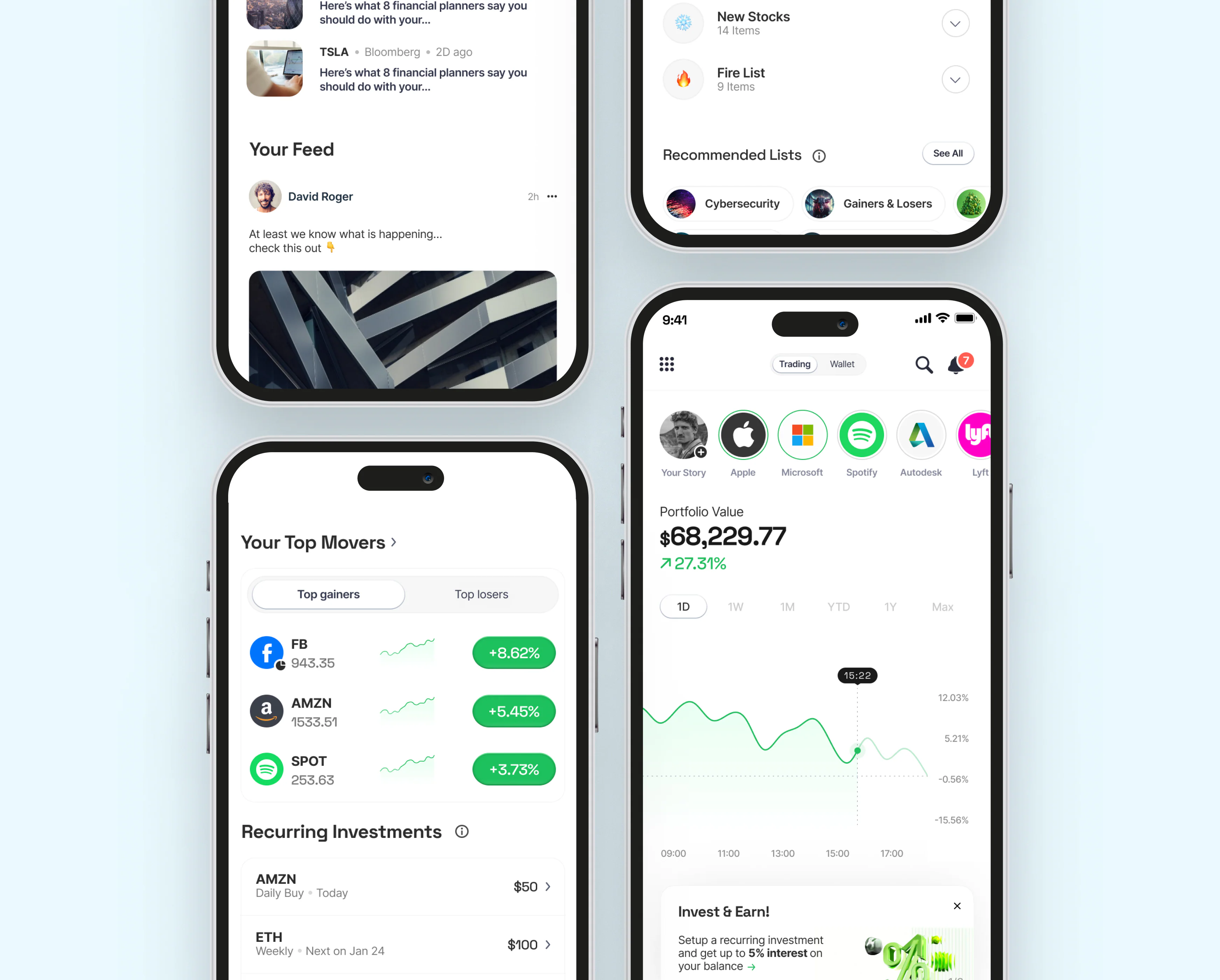
Balances, wallet context, trading content, holdings status, and market data moved into the primary view. Home now explained the account and the opportunities around it instead of acting as a thin entry point.

The goal was not to make Home busier. It was to make the first screen answer the questions users were already leaving to solve elsewhere.

That made the architecture more concrete: account state first, market context second, action paths close to both.
Avoid one default for everyone

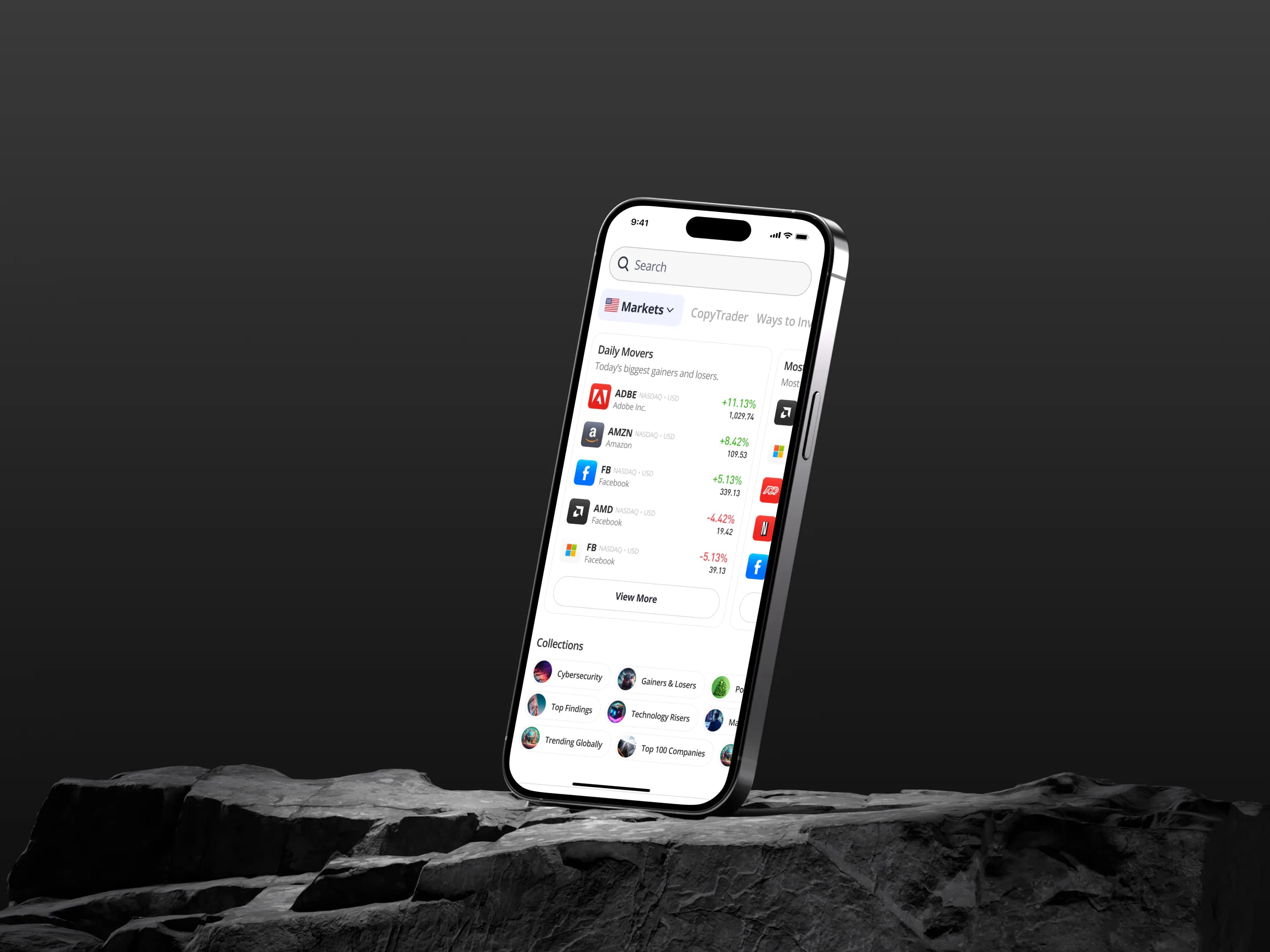
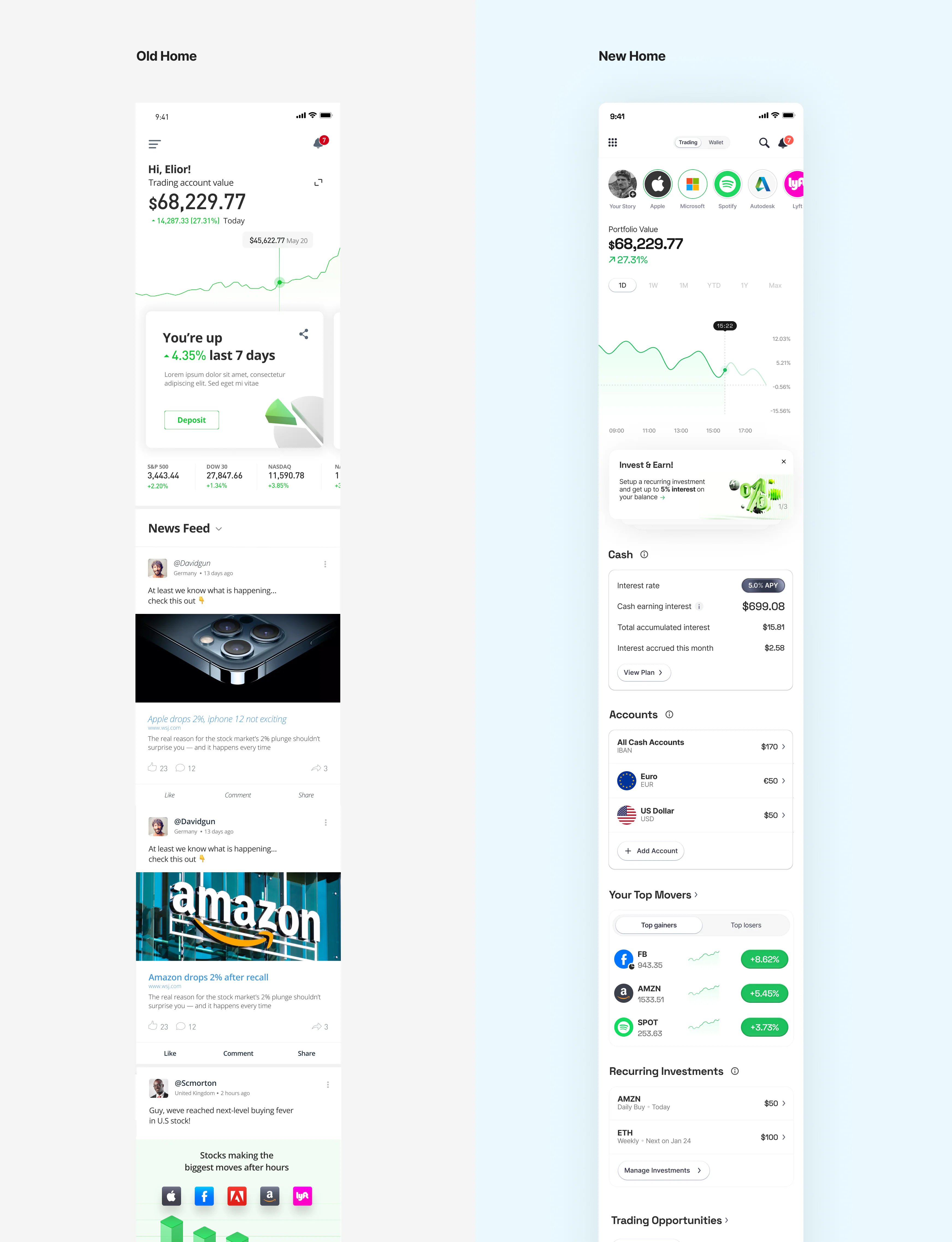
Local-market data, multiple wallets, relevant news, and social content replaced the same fixed feed for every user. Two segment-specific layouts delivered a useful first release within the legacy platform.

The tradeoff was deliberate. A configurable Home was the better long-term product, but stronger defaults gave users account value sooner.

Home layouts for different eToro user segments and market interests

Connect market context to action

Open and closed market indicators showed when an opportunity could be acted on. Shortcuts placed recurring tasks, trading opportunities, and watchlist creation near the signals that prompted them.

Each module had to justify its place through beta feedback and feature-level testing, so the page could evolve toward modularity without turning the first release into an unvalidated collection of widgets.

Frequent actions and opportunity modules in the redesigned eToro Home
Final modular components used across the eToro Home experience

Key decision

Ship two selected layouts for two user segments before building full modular personalization and user customization.

Full configuration offered more control but required substantially more development. Two segment-specific defaults improved relevance sooner and kept the architecture moving toward a modular Home.

Alternative considered: Delay release until users could configure a fully modular and personalized Home experience. / Retain one fixed portfolio amount and social-feed layout for every user.

Outcome

-0%

Immediate drop-off from Home

+0%

Actions started from Home

Looking ahead

Build the planned modular system and test which parts users actually want to configure.